modular dashboards
Azolla is a cloud-based facilities management solution incorporating IOT sensor technology to provide real-time monitoring of your facility. It includes a powerful, self-service rules engine to track and resolve IOT alerts according to service level agreements and create a complete understanding of building and equipment behaviour.
Azolla provides IoT sensors to track occupancy management, on-demand cleaning, comms room monitoring and equipment monitoring as well as integration to your Building Management System.
real-time dashboards
Work orders, iot data, work permits
")
the challenge
Azolla has a very robust IoT integration and boasts access to hundreds of different sensor types, but the way in which this data was accessed was complex and difficult for the user and was also not very demo friendly for the sales team. We also wanted this data to exist alongside the other facilities data contained within the system.
the Objective
Improve user satisfaction and adoption of IoT and deliver a demo friendly feature for the sales team.
the solution
Research and design a new modular dashboard feature.
Research
I used two sources for research purposes, the end users who are typically individuals within the Facilities Management industry. This can either be Hard Services oriented, Soft Services or both. Typically this would be a Facilities Manager role who’s primary operation is to make sure jobs are being created, done and closed off. The additional source was our sales teams and of course close competitors with feature parity.
Competitor research
My competitor research for IoT dashboards from a UX perspective focused on analyzing how other platforms handle the complexity of visualizing and interacting with large volumes of sensor data. This includes evaluating the layout, navigation, and customization options of their dashboards to identify best practices and pain points. Key aspects to assess include the intuitiveness of data grouping, the efficiency of data discovery tools (like filters or search functionality), and the ability to contextualize IoT data with other relevant datasets. Understanding how competitors balance ease of use with the display of complex, real-time data helps inform design decisions that improve user engagement and streamline workflows.


USER INTERVIEWS (Primary users)
I conducted interviews with nearly 20 Facilities Management professionals as part of the empathise phase of the Design Thinking framework. The goal was to understand their needs for actionable and real-time data to maintain operational efficiency, prioritise tasks, and leverage IoT insights for proactive maintenance. Their feedback highlighted the importance of making data both accessible and actionable.
On the Importance of Actionable Data for Work Order Management:
- “We need data we can act on quickly. If the system can’t provide insights in real-time, we risk delays in responding to critical issues, impacting overall efficiency.”
- “Having work order data that’s easy to access and interpret allows us to prioritise tasks better, avoid downtime, and reduce costs.”
- “When the system gives us actionable insights—like trends or patterns—we can get ahead of issues before they become emergencies, helping us stay proactive.”
On the Importance of IoT Data in the Technical FM Space:
- “IoT data is essential. It allows us to monitor building systems continuously and catch issues before they escalate. Without it, we’d be flying blind.”
- “Tracking hundreds of sensors in real-time is a game-changer, keeping us on top of everything from energy usage to equipment health, critical for smooth operations.”
- “In technical FM, IoT data isn’t just a nice-to-have—it’s crucial for optimising performance. Without it, we’d miss a huge part of the picture.”
Workshop with the Sales Team (Collaborate & Ideate Phases)
As part of the Lean UX framework, we ran a workshop with the three go-to-market sales team members. The goal was to collaborate on how best to present IoT data to potential clients, addressing both their pain points and how to make the IoT dashboard compelling in demos. Using ideation techniques like dot voting, we explored various approaches to improve the dashboard experience.
Key insights from the sales team during the workshop:
- Storytelling with Data: “If we can’t show the IoT data in a way that’s clear and impactful, it’s tough to convince potential clients of the system’s value. The data has to tell a story, not just be a bunch of numbers on a screen.”
- Ease of Demonstration: “When the dashboard is intuitive and we can demo how easily users can access and act on sensor data, it makes a huge difference. Prospective clients need to see how quickly they can resolve issues with the insights provided.”
- Seamless Integration: “Our ability to showcase how IoT data integrates seamlessly with other facilities information is key. The more streamlined and visual the demo is, the more likely we are to close the deal—it has to feel easy for them.”
- Real-Time Actionability: “Clients are impressed when they see real-time IoT data in action, especially when it’s presented clearly and leads to actionable outcomes. Demonstrating that in a simple, compelling way is often the tipping point.”
- Simplicity in Navigation: “A confusing or complex demo kills momentum. The more straightforward the IoT dashboard is to navigate, the easier it is to highlight the benefits and get buy-in from decision-makers.”
Notable Trends (Define Phase)
After synthesising the feedback from both FM professionals and the sales team, some notable trends emerged that inform the next define stage:
- Displeasure with Current Data Visualisation: Users were unhappy with the current visualisation tools within Azolla, which lack clarity and simplicity.
- Single Source of Truth: There’s a strong demand for consolidating data into a single, easy-to-access location rather than having to click through multiple screens.
- Salesforce Comparisons: Many interviewees mentioned how the Salesforce dashboard layout is appealing, particularly for the sales team, due to its clarity and structure.
- Mobile Responsiveness: Users expressed a desire for dashboards that are fully responsive, allowing them to access information on the go, which is crucial for real-time decision-making.
Needs
- Centralised place for all facilities data.
- The ability to create and manage multiple data widget types
- The ability to share and schedule dashboard generation and delivery.
Pains
- Current means for reporting at scale in Azolla is not very useful.
- IoT is very hard to demo
- The current dashbard in Azolla is not modifiable.
- Very hard to present Azolla figures at mettings, time costly.
Desires
- A singular experience
- Onboard to one app, pair with one app.
- To receive notifications about new Pip experiences.
SYNTHESIS
After analyzing the data, I synthesised the findings into manageable reference points, beginning with user personas and completing the contextualising with empathy maps. Contextualising the target audience’s experiences with stress management exercises will help meet their needs and goals and allows me to mould a palpable representational persona. Formed strictly from my research and interview quotes, I synthesised a user persona applying reference tools like Claritas Prizm, and Myers Briggs.

User persona & story
Contextualising the target audience’s brushes with stress management and how a potential technology could meet their needs and goals allows me to mould a palpable representational persona. Formed strictly from my research and interview quotes, I synthesized a user persona applying the Myers-Briggs Framework.

Goals & Features
👤 User Goals
- Andrew wants to access real-time IoT data from building systems to quickly respond to any anomalies or issues.
- Leverage IoT data to anticipate equipment failures and schedule maintenance proactively, reducing downtime.
- Andrew seeks an intuitive interface for managing work orders, with seamless access to both IoT sensor data and facility information in one place.
- He needs clear, digestible insights and alerts that prioritize critical issues without overwhelming him with unnecessary data.
- Andrew wants to monitor energy usage across the facility to identify areas for improvement and implement cost-saving measures.
- The ability to personalize the dashboard to highlight the data and reports most relevant to his day-to-day operations.
💼 Business Goals
- The organization aims to reduce maintenance costs by leveraging predictive maintenance and avoiding costly emergency repairs.
- Improve response times and streamline facility management processes by integrating IoT data and work orders into one efficient system.
- Ensure the organization meets sustainability goals by using real-time data to track energy usage and optimize resource consumption.
- Foster a culture of data-driven decision-making, where insights from IoT and CAFM systems inform long-term strategy for facilities management.
- Ensure that the CAFM system is easy to use for facilities teams, increasing user adoption and overall productivity.
💻 Technical Specifications
- Azolla must support integration with hundreds of IoT sensor types, providing real-time data collection and analysis across different building systems (e.g., HVAC, lighting, security).
- The platform should allow users like Andrew to configure a modular dashboard, tailoring it to display critical data relevant to his workflow.
- Incorporate machine learning or predictive analytics tools that provide alerts for potential equipment failure based on historical IoT data trends.
- Azolla should automate work order creation and prioritization based on sensor alerts, ensuring maintenance tasks are generated based on real-time data.
- The platform must offer mobile access, allowing Andrew and his team to view and manage facilities data remotely.
- Provide advanced reporting features that allow users to generate reports on energy usage, equipment performance, and maintenance schedules, with customizable parameters.
- Utilize advanced data visualization techniques to present complex IoT data in a clear, intuitive manner that simplifies decision-making.
🙏 Common Goals
- Both Andrew and the organization want to move from reactive to proactive facilities management by utilizing predictive maintenance and real-time data insights.
- Reducing maintenance and operational costs by avoiding downtime and optimizing the use of energy and resources is a shared objective.
- Both parties aim for a system that allows quick, easy access to all relevant data (work orders, IoT sensor data, energy usage) in a single, user-friendly platform.
- Improving decision-making processes at both the operational and strategic levels by leveraging data insights is a goal shared by Andrew and the organization.
- Aligning with the organization’s sustainability goals by using IoT data to monitor and reduce energy consumption is important to both Andrew and the business.
Product Feature Priorities
1. Real-Time IoT Data Integration and Visualization
- Priority: High
- Why: Andrew and the business both need real-time access to IoT data from hundreds of sensors across multiple systems (e.g., HVAC, lighting, energy usage) for proactive decision-making. The data must be visualized clearly, with customizable views that allow Andrew to focus on the most critical information without being overwhelmed.
- Feature Focus: Modular, interactive dashboards that offer real-time visualizations, alerts, and trends of building performance, with easy access to actionable insights.
2. Predictive Maintenance and Automation
- Priority: High
- Why: Predictive maintenance is crucial for minimizing downtime, reducing costs, and improving operational efficiency. Leveraging IoT data to automatically generate and prioritize work orders based on potential equipment failures allows Andrew to move from a reactive to a proactive management approach.
- Feature Focus: A predictive analytics engine that uses machine learning to analyze IoT data trends, automatically creating and prioritizing work orders when issues are detected.
3. Customizable Modular Dashboard
- Priority: High
- Why: Andrew needs a highly customizable interface to prioritize the data most relevant to his workflow. A modular dashboard will allow Andrew and other users to create personalized views that streamline access to critical information, improving both usability and productivity.
- Feature Focus: Flexible dashboard modules that users can add, remove, and rearrange based on their roles and preferences, with support for custom widgets for specific data types (e.g., energy usage, work orders, sensor alerts).
4. Mobile Accessibility
- Priority: Medium
- Why: Facility managers like Andrew and his team often work on the go, so having mobile access to real-time IoT data, work orders, and building systems is essential. Mobile access will allow for quick decisions and task management, even when team members are away from their desks.
- Feature Focus: A mobile-responsive platform or dedicated app that offers full functionality for viewing sensor data, managing work orders, and receiving alerts on mobile devices.
5. Advanced Reporting and Data Analytics
- Priority: Medium
- Why: Both Andrew and the business need comprehensive reports that consolidate IoT data, work order histories, and energy consumption. These reports help with both day-to-day decision-making and long-term strategic planning. The ability to customize and generate these reports efficiently is key for Andrew’s management and for presenting data to upper management.
- Feature Focus: Robust reporting tools with customizable templates, allowing users to create detailed reports based on energy usage, equipment performance, predictive maintenance trends, and operational efficiency metrics.
User persona & story
How Might We?
To create the physical product, I first acknowledged business aims and necessary features for user goals and then formulated a main architectural plan. The main architectural goals were developed by positing How Might We statements. These statements allow the ability to meet user needs while considering tasks and mappings of potential technology.
The particularly relevant How Might We statements followed the needs of the Andrew persona, with business goals considered.
-
How might we simplify the presentation of real-time IoT data so that facilities managers like Andrew can quickly access actionable insights without feeling overwhelmed by too much information?
-
How might we leverage predictive analytics to automate work order creation and prioritization, enabling Andrew to proactively manage maintenance tasks and reduce equipment downtime?
-
How might we design a customizable modular dashboard that allows users to personalize their view of sensor data and work orders, making their workflow more efficient and intuitive?
-
How might we provide mobile access to real-time data and work orders, ensuring that Andrew and his team can manage facilities effectively even when they are away from their desks?
User Flows
Regarding the established architectural goals from the “How Might We” exercise, I identified tasks and user flows that would meet our user persona’s needs, desires, and goals within the context of her journey. I then applied these flows to uncover an application sitemap to provide the most practical route to those goals. Leaving room for iteration, I designed a basic userflow to help illustrate and brainstorm some of the potential screen solutions before moving into UX Design.

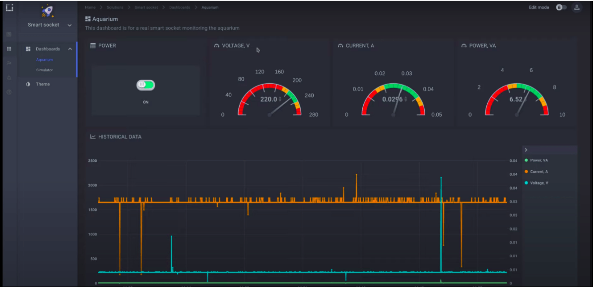
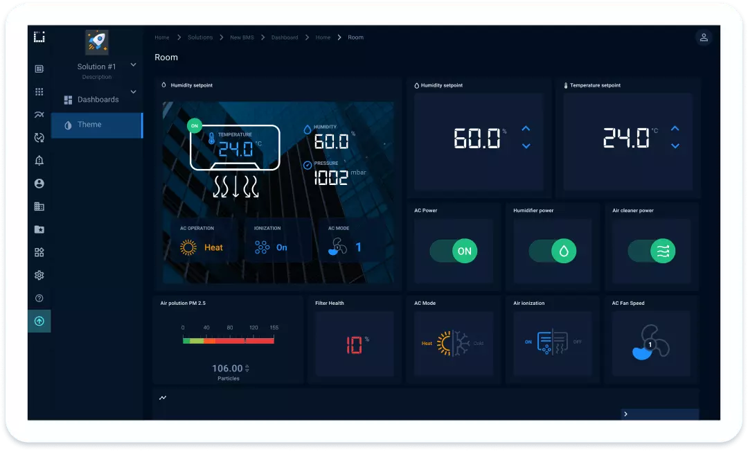
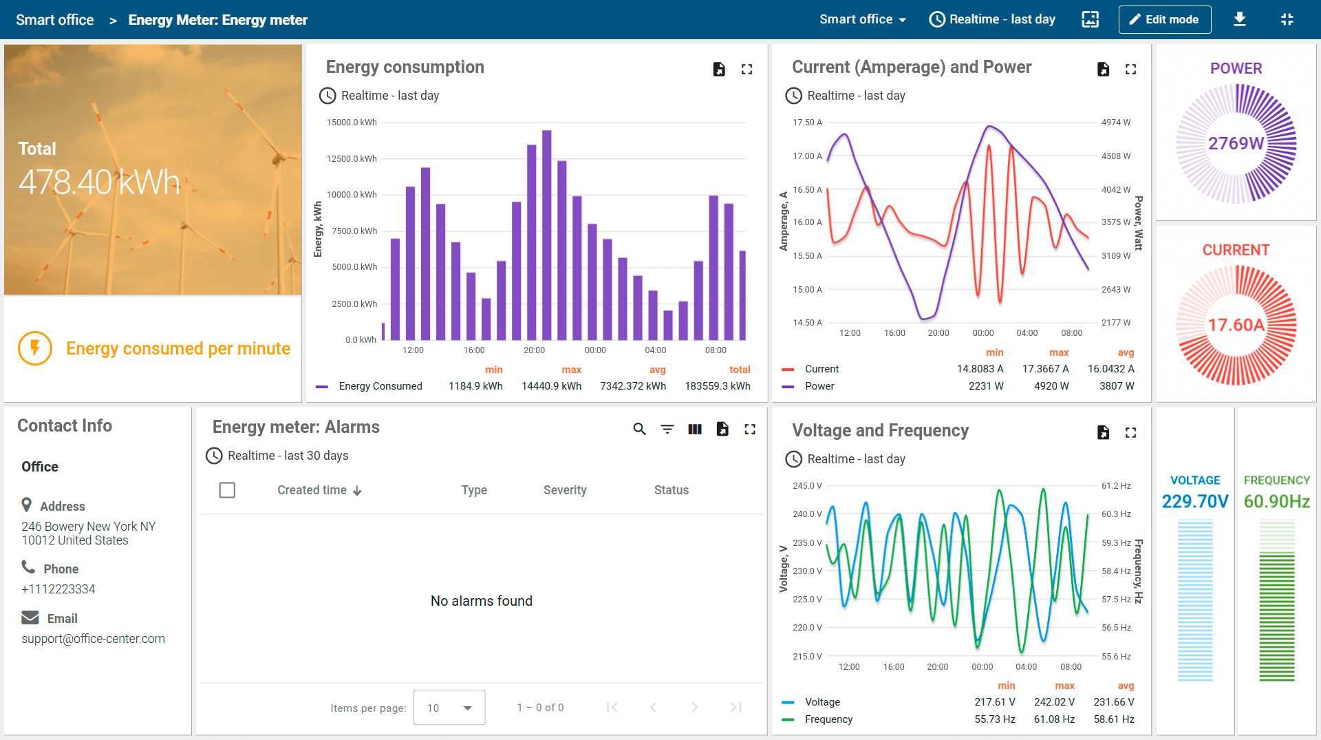
Final UI Designs
")
Comments from users two months after launch
“The new dashboard makes it so much easier to track all the sensor data in real time. I can spot issues instantly and take action before they escalate, which has really improved our response times.”
“I love how customizable the dashboard is! I can set it up to show exactly what I need without digging through endless data. It’s streamlined my entire workflow.”
“The predictive maintenance feature is a game-changer. Now, the system alerts me when equipment needs attention before anything breaks down, saving us both time and money.”
“Having everything—work orders, IoT data, and energy reports—in one place has made managing the facility so much simpler. The integration is seamless, and it’s all right at my fingertips.”