music artwork in motion
matador.
MATADOR is Ireland’s biggest musical export for electronic music. With over 1 million social followers he plays 150 concerts per year and releases multiple albums and singles. On top of all of this, he is at the helm of one of the industry’s biggest labels, ‘RUKUS‘.
This project outline specifically revolves around a graphic design project, designing new and interesting artworks and animated content for his label RUKUS.

the ask.
The music industry is all about impactful art that pushes the boundaries while keeping expenses reasonable. Matador and the RUKUS team’s main challenge was they wished to have artwork created that could also produce motion video.
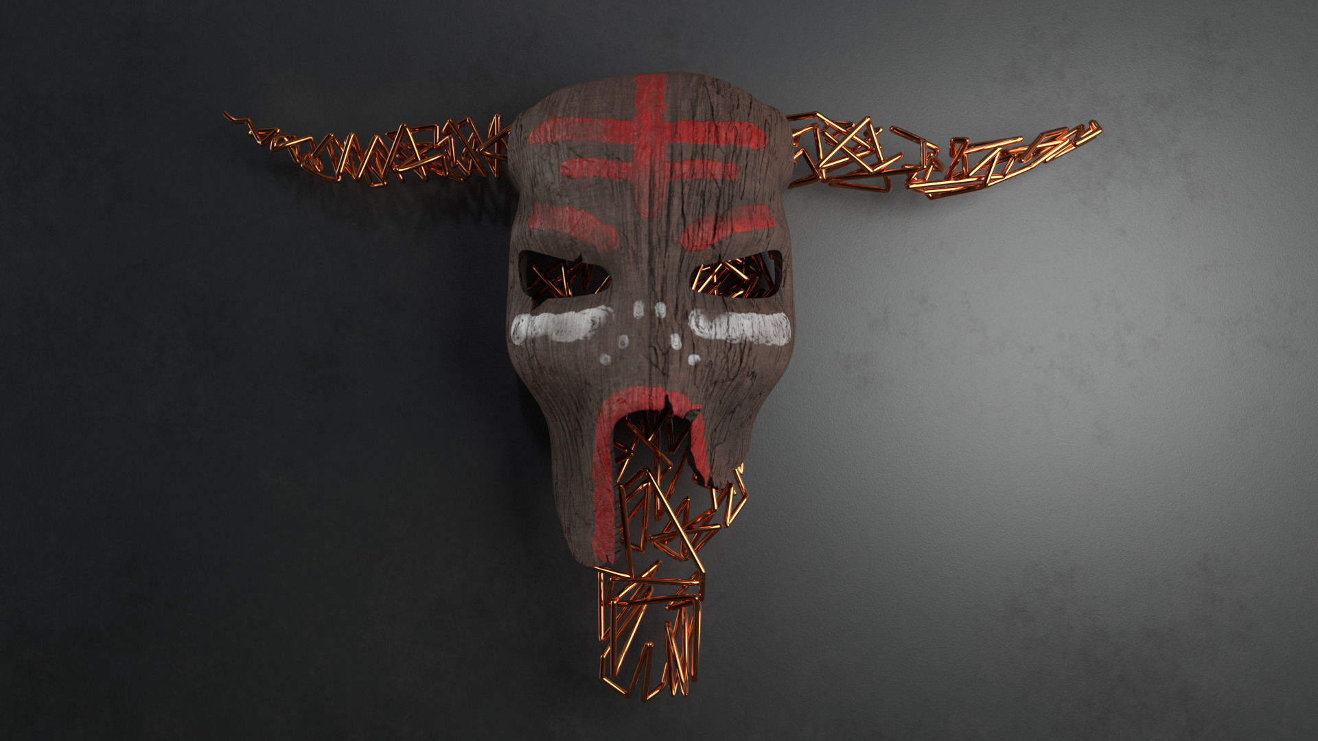
They had a concept in mind which was based on a piece of art Matador had hanging on his bedroom wall, an intricate version of the label logo made out of sticks.
They had previously used it for artwork, photographing it from multiple angles, but it was now too delicate to continue.
THE THOUGHT PROCESS
After hearing what they were looking for, I went through a few ideas.
Scan the original piece of art using a handheld 3d scanner and then import the photo geometry into Blender and rotate, add lighting, etc. This failed as the scan was too complex and the artwork too delicate.
Construct a replica of the art in miniature using multiple materials and film. This was too costly and too time-consuming.
Using a combination of Illustrator & Blender, build a wireframe version of the model as a basis for all future artwork. This ended up being the option we went with, I constructed a vector version of the artwork in Abobe Illustrator and then imported into Blender.

Matador – air ep
design and motion by russell & lee

This was the first EP we were tasked with designing. The music within the EP was a complete break from Matadors typical sounds. Usually his music was dark and moody, using rhythmic elements to drive the tracks and provide recognition. However this EP had a lot of big melodies and had an almost South American vibe.
We went with the idea of the core RUKUS bull mesh design with simple colours spattered against the wall around it. The colours were chosen because of the Brazilian sounds of the record and also to make it stand out on Beatport amoungst the other artwork.

We used the blender application to create wide versions of the artwork for social media hero shots.

limitless angles
We could also use blender to change the camera angle completely, allowing us to create fresh and interesting content each time. This is very important when it comes to social media as it allows for the artwork to be used multiple times without it becoming stale or boring.
in motion
key framed and rendered by russell
The great thing about working within a 3D application like blender is that you have complete control. The difficult thing is that rendering takes a shit load of time.
I was happy with the result of this and the animations fit the pace of the music, being slow and transitional, using shadows cast by an animated light to give movement.
However, for this method to work with faster music, I had to try and figure out how to add more motion without blowing up my computer.
Joran Van Pol – immediate ep
design and motion by russell & lee

Amsterdam-based DJ/Producer van Pol exploded onto the international techno scene with his own take on minimal style, having previously released on MINUS, SCI+TEC, IDEAL AUDIO and REJECTED as well as his own FADE label. His dynamic approach to music has since enthralled listeners worldwide and sets the tone for performances this summer at Welcome to the Future Festival and Loveland. ‘Immediate’ opens the EP with a distant, yet emphatic bass, and a clamour of ominous horns, evoking a perilous, subterranean, time without end.

For the artwork design, we again wanted something that would allow for use to apply motion to the lighting in the scene, casting interesting shadows which we could then time with the music for the social videos. We discovered that we could experiement in blender with the mesh texture.

limitless angles
We went with an ear phone cabling texture and style. We learned from the artist that they heavily used analogue synths and dynamics when producing the music. With that in mind we wanted to evoke that analogue feel with the artwork. But, as its techno we also wanted a cold industrial feel with a concrete floor.
in motion
key framed and rendered by russell
In this motion video, we again went with the idea of light motion. Casting interesting shadows against the cold concrete floor while adjusting the camera in and out.
Although we introduced two sources of animation, the result for motion in this artwork was still kind of flat.
We knew going forward we needed to introduce some additional editing tools into the workflow.
Lorenzo bartoletti – KOrowai ep
design and motion by russell & lee

‘Monasterio’ opens with a loopy, rustling groove and hi-hats accented with chanting vocals. Moody synth notes rule amid a floating baseline, shaping tone and shifting perspective. First up on the remixes is one of Spain’s most exciting artists, Andres Campo, and his rework of the title track.
Delivering peak time perfection with a pounding kick and lo-fi action, Campo paves the way for an epic breakdown of old and a sirenic call to the dancefloor. Darius Syrossian’s inimitable skill as a musician shakes ‘Cinque Marzo’ to it’s core with an edgy cut of 909 house percussion and glitchy riffs. Punctuated, breathy vocals hover above a bowling baseline as the track twists and writhes in jaunty, triumphant flair.
For the artwork, we wanted something intense, we wanted it to feel real and almost have the feel that the item was custom built for the release. We chose a red hot branding iron, this would allow us to play with the angles and light source for motion work.

The fact that the artwork item itself was the light source for the scene, was felt to be a real improvement. Giving a real sense of high end and expensive.

limitless angles
Every angle of this artwork gave you a new perspective, with slight variations in light intensity added to give the impression of dispersal of heat across the branding iron. Also, showing off the rustic wooden handle.
in motion
key framed and rendered by russell
Making the scene more interesting was our way of making each angle of the scene new and interesting. The room the iron was in, was supposed to be almost as interesting.
With the motion videos we were able to show new angles for each of the four preview videos.
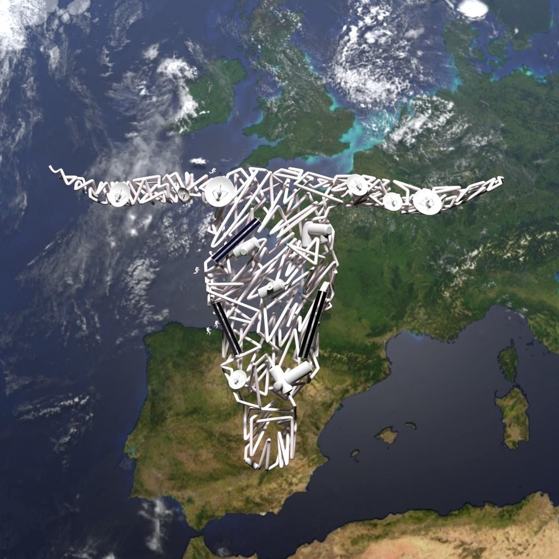
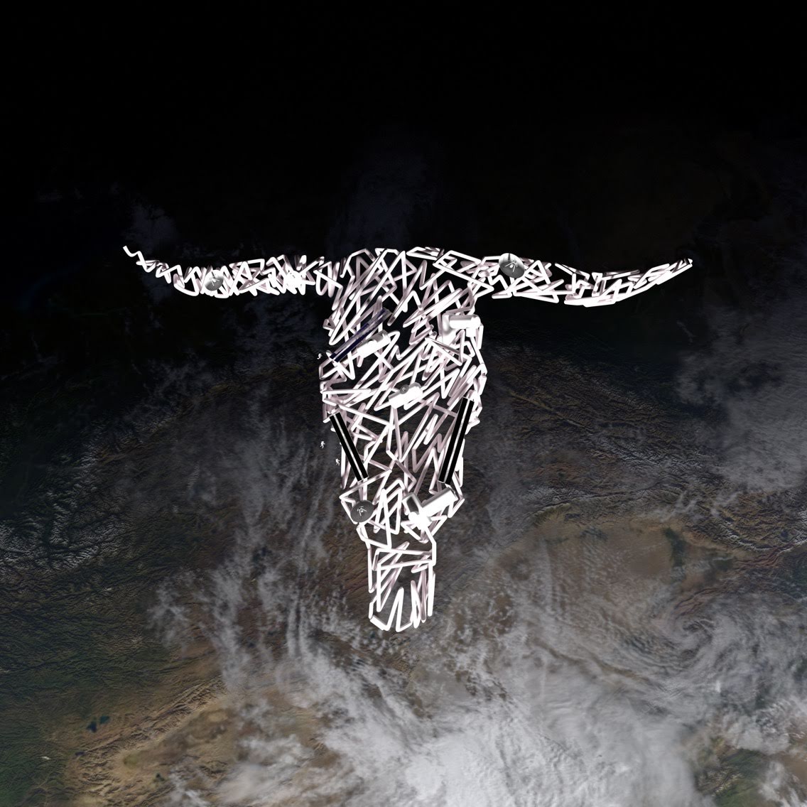
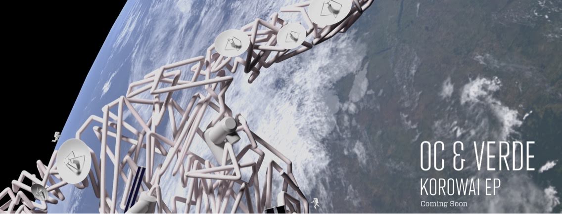
OC & VerDE – immediate ep
design and motion by russell & lee

‘Korowai’ packs a punch from the very first hit with a tight 808 kick and a rolling 16th bass line. Daring, dreamy melody and fearless rhythm build to a sonic crescendo, commanding the ear and the dance floor.
We knew we needed something special for this artwork as the song was very good. We were influenced by the colours of Daft Punk and by the mechanics of tube based neon lights. We played with the textures of the mesh to turn them into lights of multiple colours. We contained the lights inside the mesh bull head.
Like the previous artwork, the artwork itself was the light source for the scene.

The wide hero shot for this artwork, we felt was well complemented by a dark textured floor which was highly reflective.

limitless angles
Every angle of this artwork was a pleasure to render. By using depth of field settings within the virtual camera we were able to give a hyper realistic look and feel, with some fans thinking the label actually built it for real.
in motion
key framed and rendered by russell
The repetitive aspect of this song could of actually come off as boring within the motion artwork. For this I introduced a new workflow. Instead of using blender to render the entire movement. I rendered out individual frames and then used Adobe Premiere Pro to piece the images together.
This allowed for me to create a great deal of movement in the video, without any actual camera movement. Keeping it interesting for each preview.
matador & artbat – apollo 11 ep
design by russell & lee

Matador and ARTBAT release their debut collaboration ‘Apollo 11’ on Matador’s RUKUS imprint. When two of the hottest techno acts announce an alliance, a hypersonic gestalt is created. Their two-tracker, named after the first successful moon landing craft, is out of this world, and arrives bang on target.
There was a lot of pressure for this artwork, being such a big release, we needed to make sure the quality was up to scratch. There were a number of failed attempts for this artwork. We initially thought to go with the idea of space, but after a chance encounter with a tesla coil. I drafted a two dimensional mock up, which was approved and passed to Lee to work his magic.

The resulting artwork was exceptional, beautifully designed forks of electricity sat mid-air attached to two tesla coils mounted on a wall. As if it were a moment snapped with a camera.

limitless angles
Like the Korowai artwork, any angle was equally impressive. The energy of the artwork, perfectly capturing the energy and hype around the release.
in motion
key framed and rendered by russell
The difficulty for this artwork and the EP it represented, was the music was more progressive and emotive. This slower, evolving pace meant that the artwork should feel like it was growing.
In real life, the electricity would snap in and out quickly. I needed to slow it down, as if someone was videoing the tesla coil with a 1000fps camera.
This involved an extreame amount of keyframe work within Blender. Every fork of lightning had to grow at a different rate, all leading to the same point where the artwork is formed out of the light.
VARIOUS ARTISTS – 3AM VOL 1 ep
design and motion by russell & lee

To kick start the summer season RUKUS launches 3AM, and heralds a new sampler series for Matador’s imprint. This first edition features label debuts from AARYON, and Daniel Blackman, and the welcome return of Russell, and WHYT NOYZ. Celebrating fresh and creative original cuts perfect for peak time plays, 3AM embraces innovative and timeless music from artists offering sublime immersion in main room moments.
As this was a compilation of different styles and angles of music, we went with a low polygon shape. To add more interest to the design we included a multi-coloured strip of light. This was make the design a little warmer, but also to provide something we could animate for the motion videos.
.

The hero image provided no further visual detail as a plain solid colour wall was chosen as the backdrop.

limitless angles
This artwork angled well, we used an interesting reflective texture that provided interesting variances in light reflection off of the low poly panels.
in motion
key framed and rendered by russell
Motion was achieved by combining camera movements, light source movements and the deformaity of the low poly panels.
When combined alongside quick cuts in Premiere Pro, it delivered content that was both interesting and still creatively iterative on previous designs.
This was our final design in the series.
Rejected designs
blood sweat and tears